
Diems
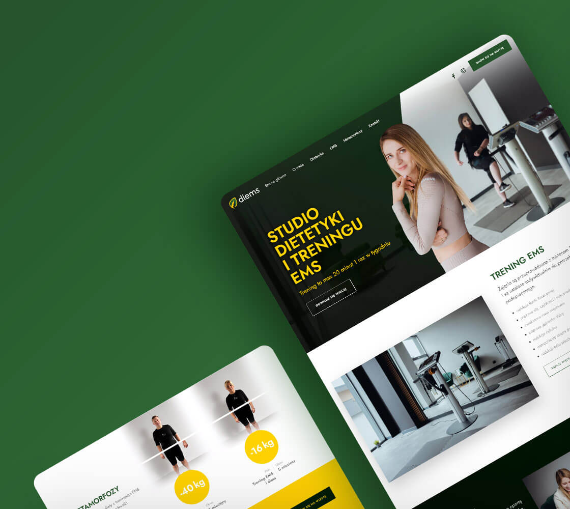
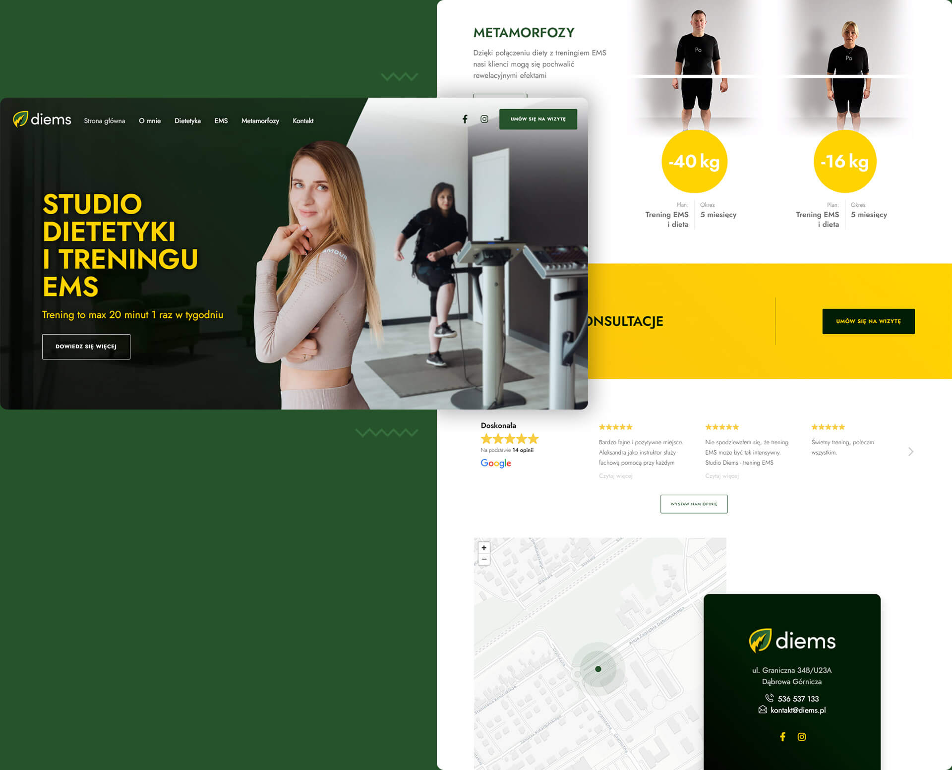
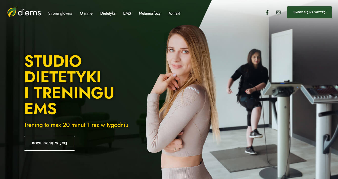
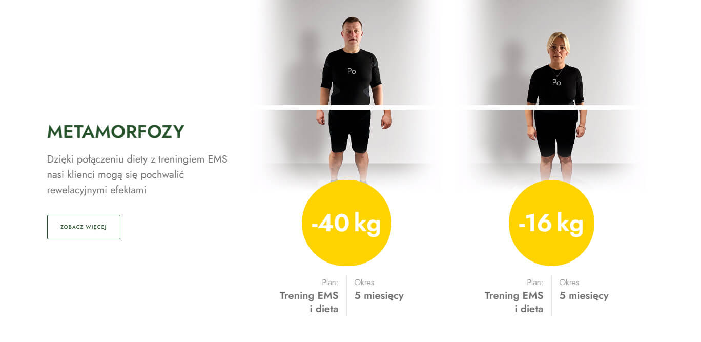
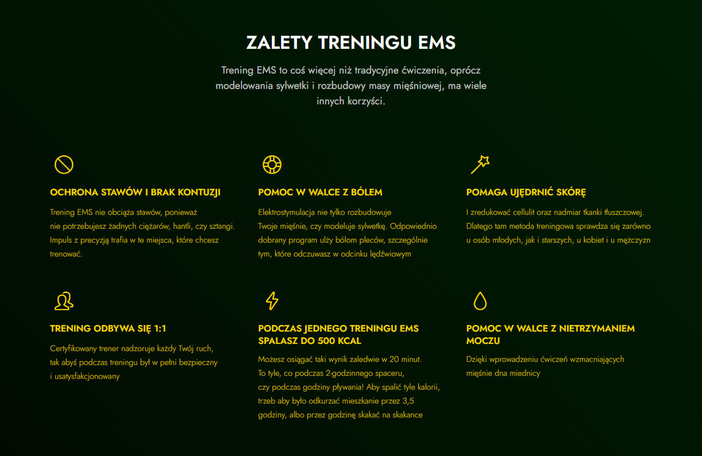
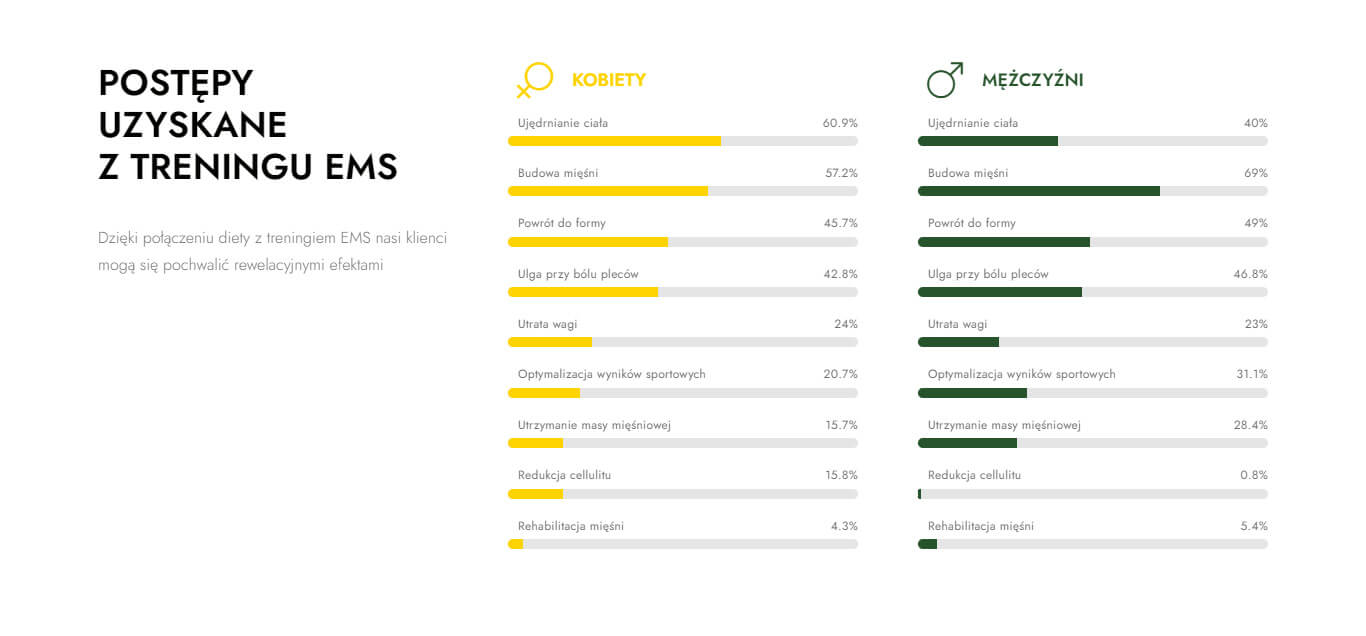
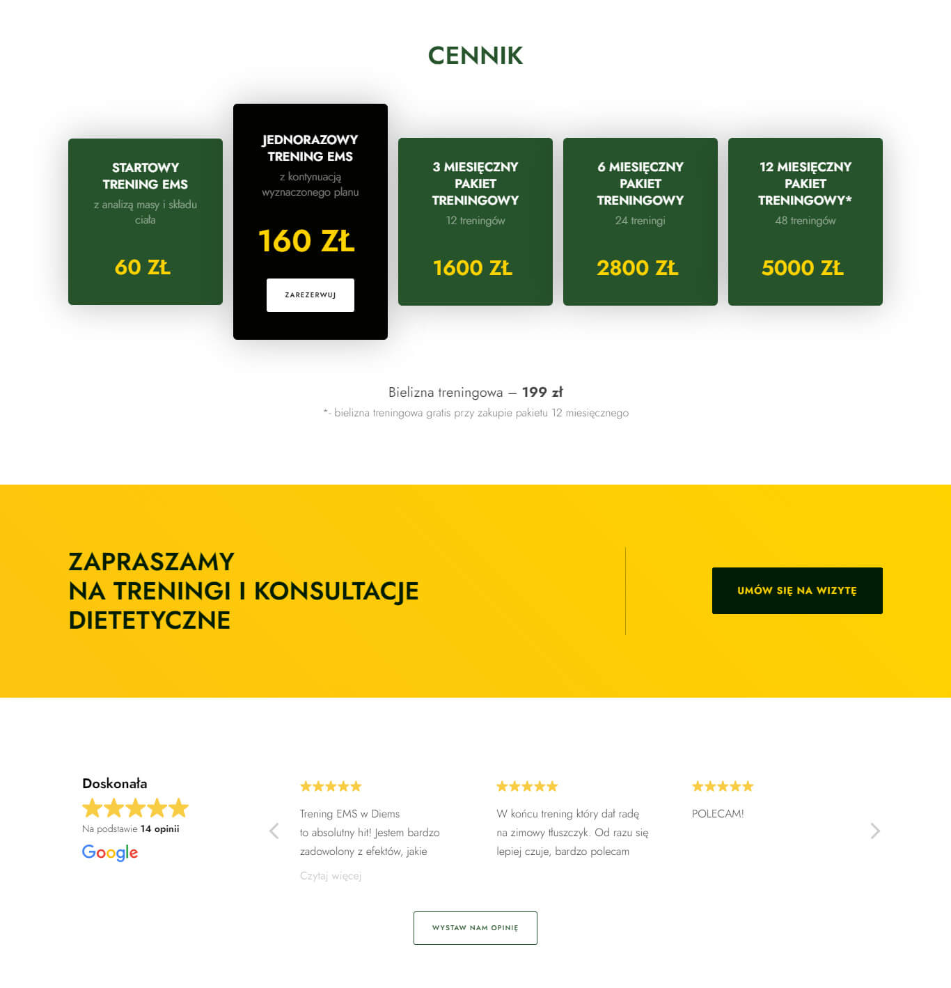
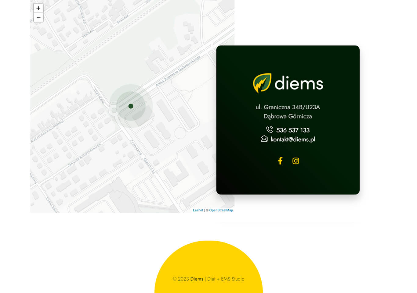
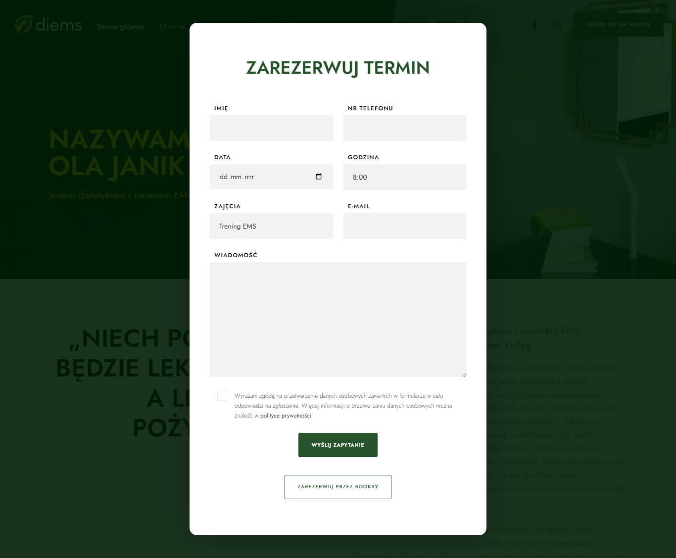
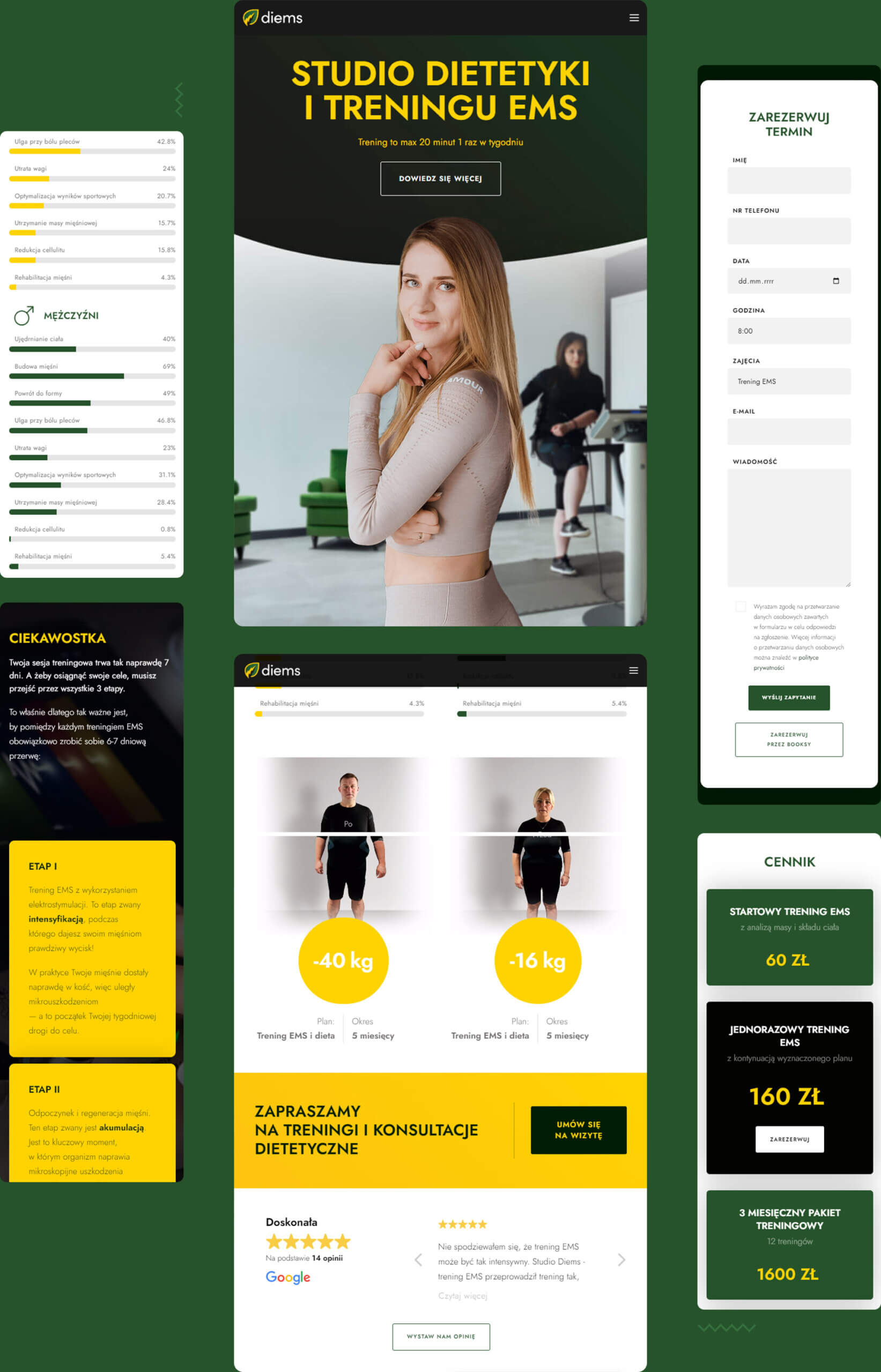
I made rebranding for Diems, a company that focuses on diet and EMS training. This included designing a new logo, visual identity, responsive website and social media graphics.
Tools
wordpress –
css & html –
figma –
photoshop –
Designs
wireframe –
user interface –
branding –
social media –
BRAND
The Diems brand logo consists of a spinach leaf and a lightning bolt, representing the fields of dietetics and EMS training. The leaf symbolizes naturalness and approach to health, while the lightning bolt is associated with the energy, speed, and effectiveness of training.
The colors of bottle green and gold additionally highlights the natural and luxurious character of the brand. Green is associated with nature, freshness, and health, while gold represents luxury and quality.”

UI
Mobile
Media
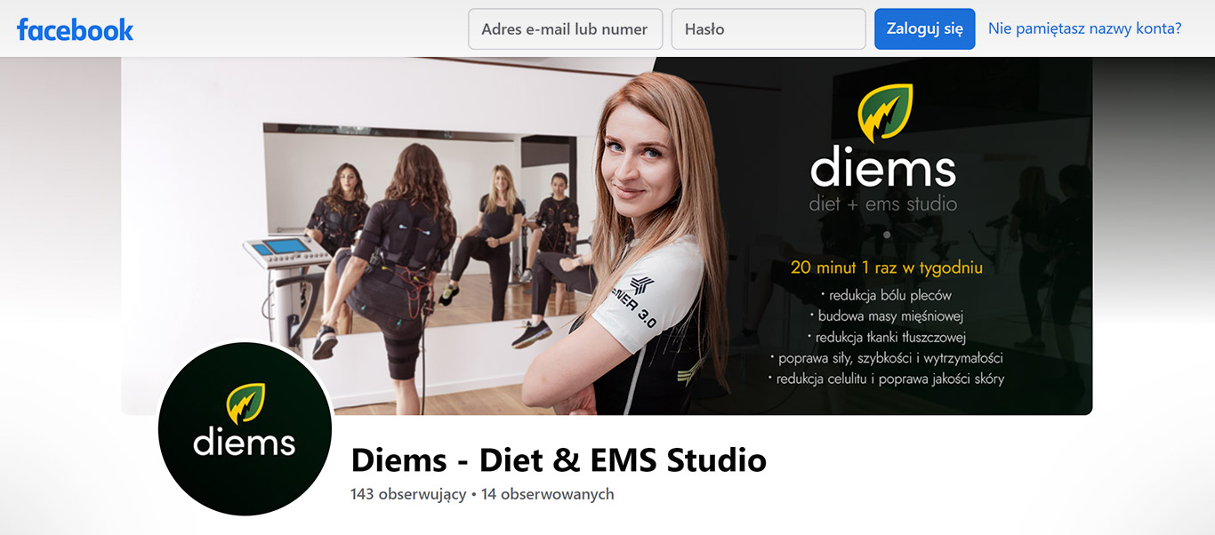
I created social media graphics that are consistent with the visual identity, including a cover photo and profile picture.
The cover photo features a group of people exercising and a trainer, which helps to build a personal brand.