Lendit.
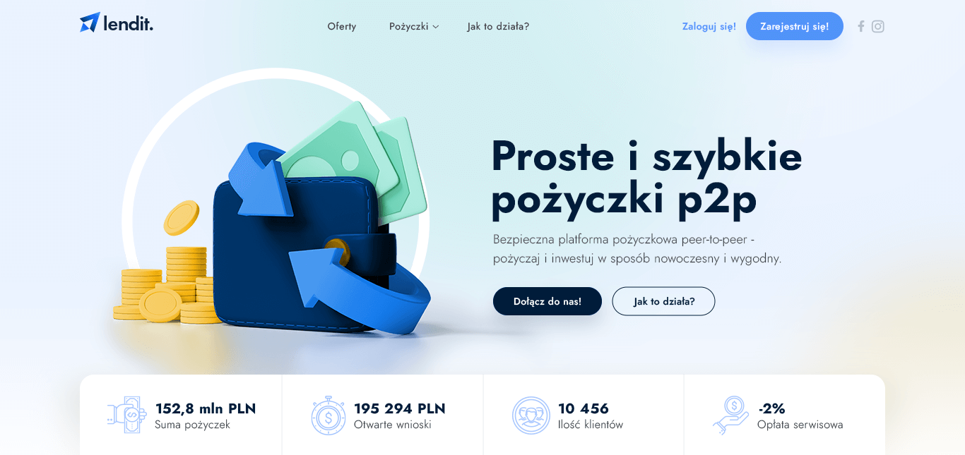
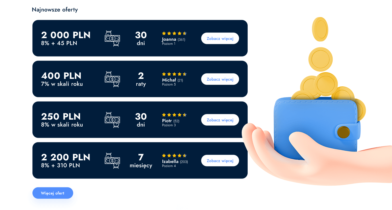
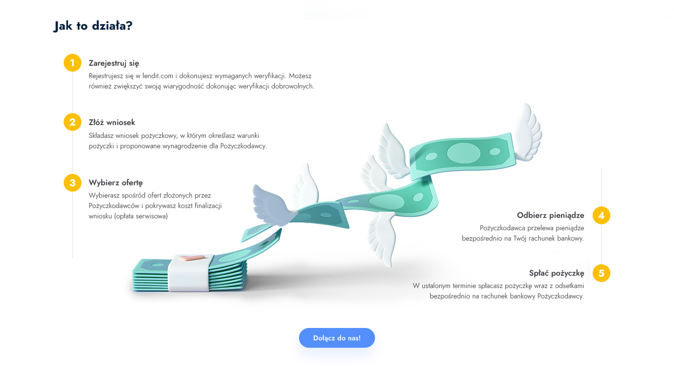
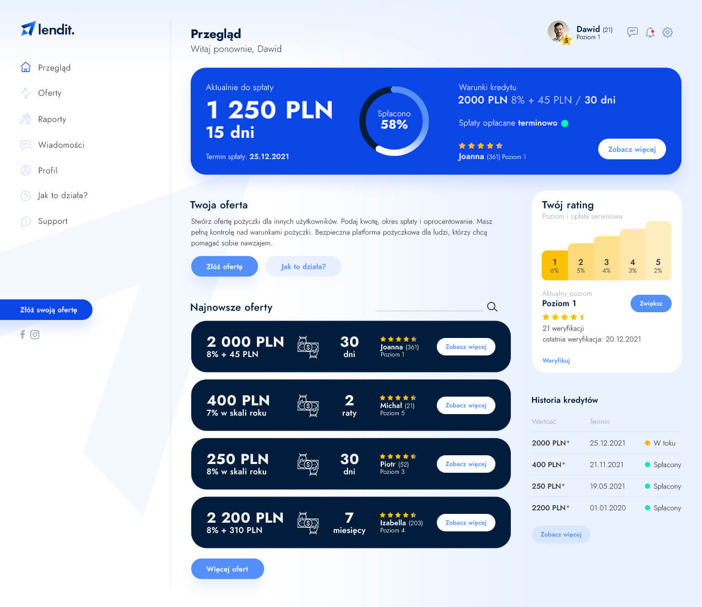
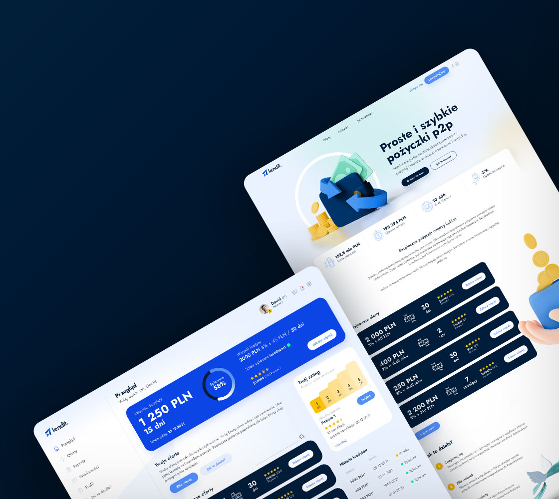
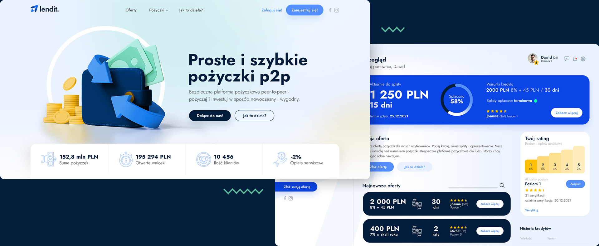
I designed a landing page website for a P2P lending program and a backoffice for registered users. The website presents the key information about the program, its benefits, and how it works, while the backoffice allows users to manage their loans and track their progress. All elements were designed with simplicity and ease of use in mind.
Tools
figma –
illustrator –
photoshop –
Designs
brand –
wireframe –
user interface –
BRAND
The logo consists of two arrows that represent borrowing and returning, which are arranged in opposite directions. The arrows use negative space.
The color palette chosen for the logo is navy blue, which symbolizes stability, trust, and financial safety – values of a company.

UI
Landing Page